ANALYSIS OF HANDWRITING TEXTS IN ARABIC AND LATIN ALPHABET I
In this new post I will show writings made by the same writer in two alphabets; Latin and Arabic.
Certain parameters of expertise that are also contemplated in graphology will be analyzed, such as: Margins, Inclination of lines; size and spaces in order to reach some conclusions that facilitate the analysis of this type of writing that lead to reliable guidelines that can be applied to identify the writer.
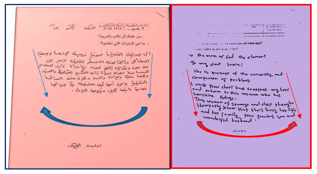
The text on the left written in Arabic and the one on the right in English show us a very similar scriptural box, taking into account the change in the scriptural pattern of the text in Arabic (writing from right to left) that is divergent to the written language English (writing from left to right).

In the following texts there are two types of writing on the same paper, two interesting issues stand out:
1st.- The line in the case of writing in Arabic is descending and in the Latin alphabet it changes in direction as it differs in the sense of the scriptural pattern.
2nd. – In the English language text, you can see the confusion that occurs on the part of the writer in the use of capital letters, I remember that in Arabic there are no such letters but also it shows which has been his maternal writing.
There are many parameters if we make a deep comparative study that can reach conclusions that facilitate the work of the expert or graphologist in their study and analysis.

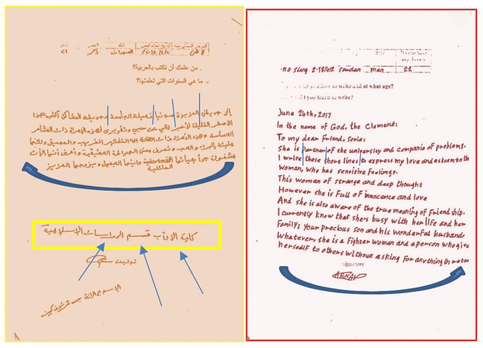
In the texts that appear below you can observe other interesting things from the calligraphic point of view. Since in a single sentence three different types of calligraphy appear:

From right to left, it begins with calligraph Kufi, continues with Nash and ends with Ruq’a.
You can also see the separation between words that is quite similar to the font size.
The two writings converge in a concave structure in the alignment of the all scriptural sample

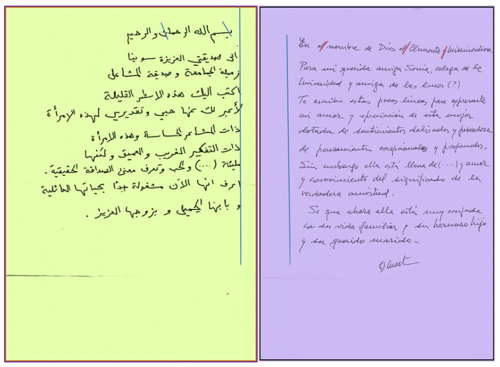
And in these examples, we can see in the following scriptural samples show a similar structure and cleanliness both. Margins are respected in both Arabic and Spanish.
In Arabic, shorten the sentence for fear that it does not fit (since in Arabic you cannot cut the word and continue in the next paragraph). It is a Nash calligraphy with many Ruq’a winks that as a reminder means «piece» and refers to the fact that the writing was restricted to a piece with which it tends to simplify its graphic gestures and thereby raises the pattern of writing towards verticality sinuously.
In this case very slightly since primary education prevents it and shows its imprints in scriptural art.
The inclination of the scriptural feature is divergent in inclination as is obvious from the direction of the writing in Arabic.

And finishing this small analysis with the proposed examples, there is a question such as: what is all this for? The answers may be multiple or none depending on who has asked the question. The one who understood, understood and the one who did not that investigate it!


